
Secondary reference shelf
Web systems worth studying.
Useful interface and product mechanisms, kept separate from the art and movement canon.
3 references · technical studies, not the center of the collection
Context archiveLeo commentary + AI close-reading
Separate context layer
Reference notes
Your commentary and the AI close-reading remain paired, but neither competes with the visual wall.Tech & Business · current editorial system
Editorial density can still feel composed
One of my cleanest sites. It feels intelligent because it is not afraid to be different, although it is still not my ceiling.
AI close-reading
What the source gives us
The homepage earns density through hierarchy rather than empty space. A persistent editorial rail, differentiated story scales, disciplined borders, and selective imagery make a large amount of information feel intentionally sequenced.
Transferable mechanism
Compose a publication as several simultaneous reading speeds: a stable orientation layer, one dominant story, compact current items, and clear category signals. Density works when every region has a distinct reading job.
Do not flatten it into
Do not turn the system into a generic card dashboard or treat its current form as a finished ceiling. The reference is the editorial rhythm and information behavior, not a frozen component kit.
Netflix · design-system ancestry
The field sells abundance before the interface explains it
Netflix research helped shape the original Tech & Business redesign.
AI close-reading
What the source gives us
The landing composition makes the catalog perceptible as a world before asking for a decision. Tilted media tiles create depth and abundance while the centered promise remains unusually simple and legible.
Transferable mechanism
Let many visual units establish the size and energy of a collection, then give the primary action a calm focal plane. Discovery feels rich when the surrounding field implies more than the viewer can consume at once.
Do not flatten it into
Do not copy Netflix chrome, tile angles, copy, or brand composition. Transfer the contrast between catalog abundance and decisional simplicity only when it serves the content model.
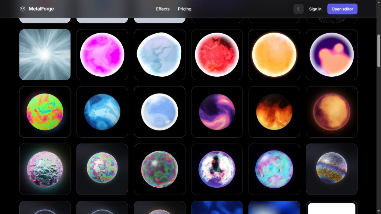
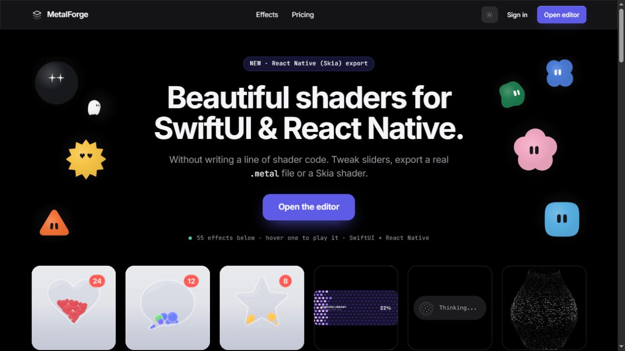
Metal Forge · interactive shader and effects library
A visual mechanism becomes useful when its physics are inspectable
Pretty awesome stuff. Physics and consistency make sense, and individual mechanisms could help Tech & Business.
AI close-reading
What the source gives us
The effects grid is valuable because it exposes many coherent material behaviors at once while keeping each specimen bounded. The page invites comparison of surface, light, deformation, and response instead of presenting motion as decorative spectacle.
Transferable mechanism
Study one physical behavior at a time—elasticity, refraction, drag, collision, glow, or displacement—then reuse only the behavior that clarifies hierarchy, state, or continuity in a new composition.
Do not flatten it into
Do not import a shader because it looks expensive. If its motion does not explain a state change, reinforce an object, or guide attention, it is visual noise.